
Borbata
First Look at БОЯБАТА’s Concept Icons
Tom van der Spek
01-09-2026 · 1 min read
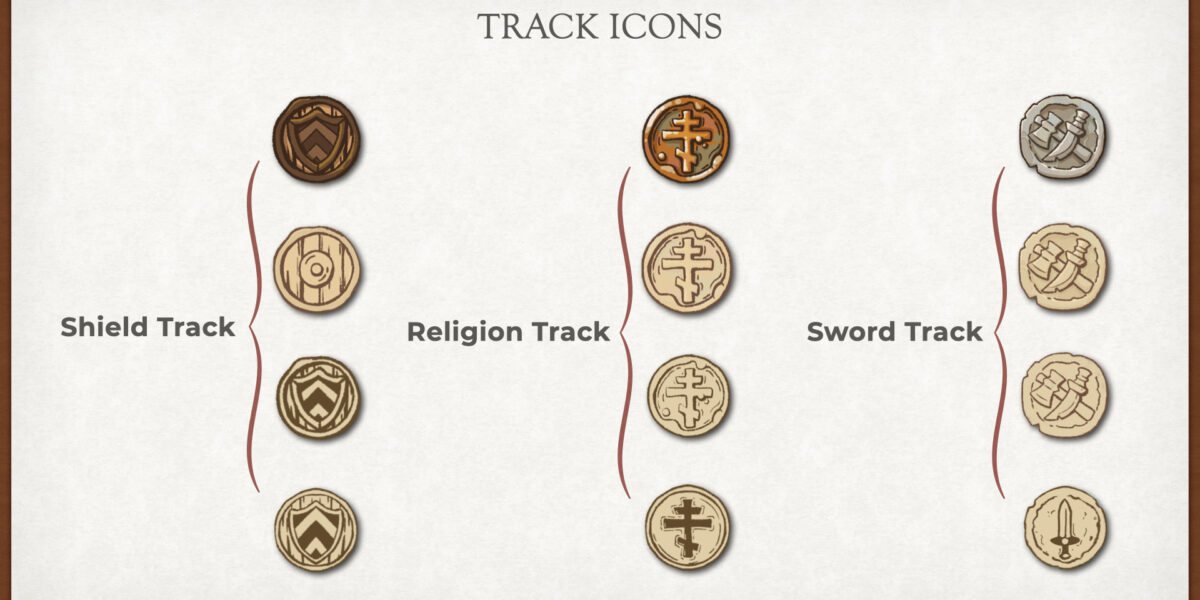
The development of БОЯБАТА (Borbata) is becoming clearer by the day. Today, we are sharing a first look at the concept icons for the game.
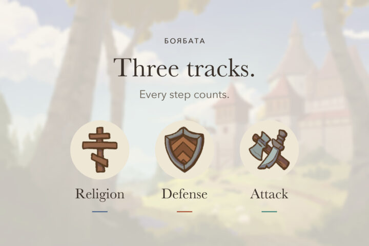
These icons will help players find their way around the board at a glance. They give the different tracks and game elements a recognisable visual language.
For БОЯБАТА, we do not want to rely on a generic medieval fantasy look. The icons need to fit the game’s historical and geographical setting: the southeastern borderlands of Europe at the end of the Middle Ages.
That is why we look to historical symbols, architecture and materials from the region. This gives every detail a clear function at the table while also contributing to the world of БОЯБАТА.
These concept icons are only the beginning. They already offer a glimpse of the direction in which БОЯБАТА’s visual identity is developing. We look forward to sharing more of what is taking shape behind the scenes.
What do you think of these first concept icons?

Tom van der Spek is co-founder of Van der Spek Sons Publishing, an independent board game publisher from the Netherlands. Together with his brother Robert, he works on creating and publishing engaging tabletop games, with Borbata as their upcoming title.

Leave a Reply